
Contract review
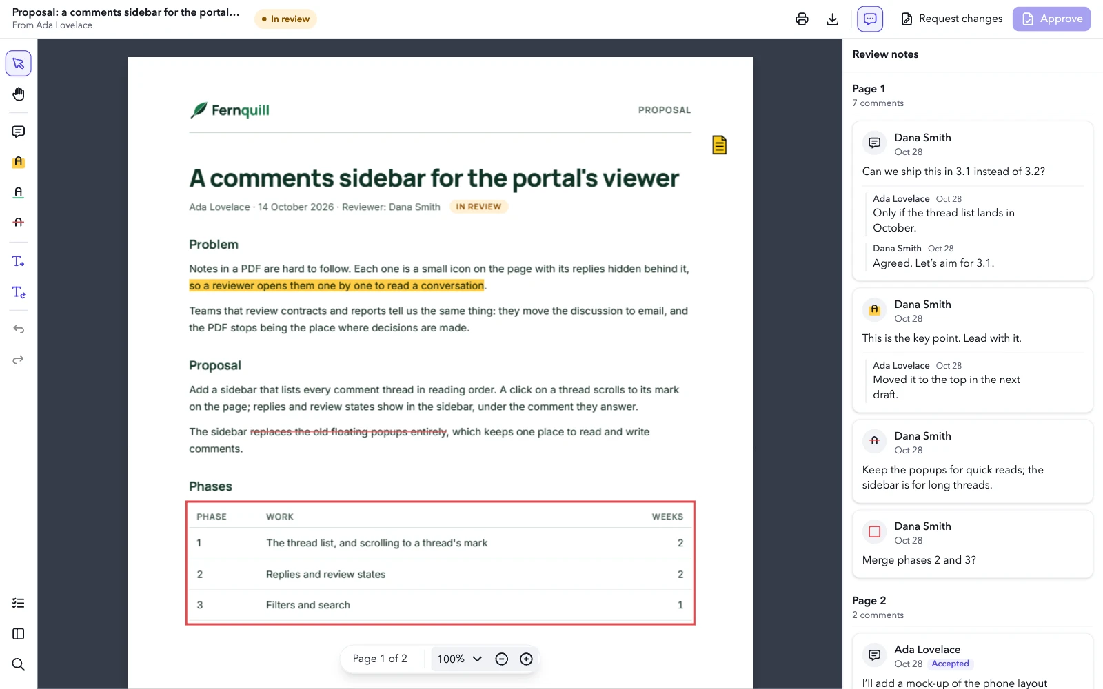
For a legal or sales team reviewing a document someone sent them. The viewer gets an app bar of its own with the document’s name, the review status and the verdict; the review tools sit on a rail, the notes stay docked on the right, and a checklist of its own opens beside the rail. Approve waits for the checklist: it stays greyed out until every item is ticked. Its colors, font and words are the review’s.
import { useState } from 'react';
import {
  Panel,
  PDFViewer,
  ToolbarItem,
  type Viewer,
  type ViewerConfig,
} from '@embedpdf/viewer-react';

import './review.css';

const proposal = '/pdfs/proposal.pdf';

type Status = 'review' | 'approved' | 'changes';

// What the commands read from the app: the ticked checks, the status and how to set it.
interface Review {
  done: string[];
  status: Status;
  setStatus(status: Status): void;
}

const STATUS: Record<Status, string> = {
  review: 'In review',
  approved: 'Approved',
  changes: 'Changes requested',
};

// What the reviewer checks before a verdict, in the Checklist panel.
const CHECKS = [
  'The problem is stated clearly',
  'The phases and weeks add up',
  'Each open question has an owner',
  'Every review note has an answer',
];

// The review's look, words, tools, verdict and layout. A constant: the commands read the app
// from `appState`, so they never hold an old value.
const config: ViewerConfig<Review> = {
  theme: {
    preference: 'light',
    accent: '#4f46e5',
    tokens: {
      background: '#eef0f4',
      surface: '#ffffff',
      'surface-raised': '#ffffff',
      text: '#161a23',
      'text-muted': '#5d6474',
      border: '#dde1e8',
      hover: '#f0f2f6',
      canvas: '#363c4a',
      radius: '8px',
      font: '"Avenir Next", Avenir, "Segoe UI", system-ui, sans-serif',
    },
  },
  icons: {
    approve: [
      'M14 3v4a1 1 0 0 0 1 1h4',
      'M17 21h-10a2 2 0 0 1 -2 -2v-14a2 2 0 0 1 2 -2h7l5 5v11a2 2 0 0 1 -2 2z',
      'M9 15l2 2l4 -4',
    ],
    requestChanges: [
      'M14 3v4a1 1 0 0 0 1 1h4',
      'M17 21h-10a2 2 0 0 1 -2 -2v-14a2 2 0 0 1 2 -2h7l5 5v11a2 2 0 0 1 -2 2z',
      'M10 18l5 -5a1.414 1.414 0 0 0 -2 -2l-5 5v2h2z',
    ],
    checklist: [
      'M3.5 5.5l1.5 1.5l2.5 -2.5',
      'M3.5 11.5l1.5 1.5l2.5 -2.5',
      'M3.5 17.5l1.5 1.5l2.5 -2.5',
      'M11 6l9 0',
      'M11 12l9 0',
      'M11 18l9 0',
    ],
  },
  // The words of a review.
  strings: {
    en: {
      // The comments panel's button and its header.
      'panel:comments': 'Review notes',
      'tool:note': 'Review note',
      'annotation:comment': 'Review note',
      'tool:strikeout': 'Suggest a deletion',
      'tool:insert-text': 'Suggest an insertion',
      'tool:replace-text': 'Suggest a replacement',
    },
  },
  // What a review doesn't need.
  disable: [
    'shapes',
    'stamps',
    'signatures',
    'forms',
    'redaction',
    'measurement',
    'attachments',
    'pages',
  ],
  // Deletions in red, suggestions in the review's own color.
  plugins: {
    annotation: {
      tools: [
        { id: 'highlight', defaults: { color: '#ffcd45' } },
        { id: 'underline', defaults: { color: '#30a46c' } },
        { id: 'strikeout', defaults: { color: '#e5484d' } },
        { id: 'insert-text', defaults: { color: '#4f46e5' } },
        { id: 'replace-text', defaults: { color: '#4f46e5' } },
      ],
    },
  },
  commands: [
    {
      id: 'acme:approve',
      label: 'Approve',
      icon: 'approve',
      shortcut: 'Mod+Enter',
      // Greyed out until every check is ticked, and pressed once approved.
      enabled: ({ appState }) => appState.done.length === CHECKS.length,
      active: ({ appState }) => appState.status === 'approved',
      run: ({ appState }) => appState.setStatus('approved'),
    },
    {
      id: 'acme:request-changes',
      label: 'Request changes',
      icon: 'requestChanges',
      // The status, then the note tool, to say what should change.
      run: ({ appState, viewer }) => {
        appState.setStatus('changes');
        void viewer.commands.execute('tool:note');
      },
    },
  ],
  layout: (layout, env) =>
    layout
      // Your own bars take the place of the toolbar, and the mode bars along it go with it.
      .removeBar('main')
      // The review bar: the document and its status, then the verdict.
      .addBar('review', {
        place: 'top',
        start: [
          env.size === 'compact'
            ? [{ custom: 'status' }]
            : [{ custom: 'title' }, { custom: 'status' }],
        ],
        end: [
          { items: ['document:print', 'document:download'], importance: 2 },
          ['panel:comments'],
          {
            items: [
              // Short of room, Request changes gives up its label first: Approve keeps its own.
              {
                command: 'acme:request-changes',
                variants: ['icon+label', 'icon'],
                importance: 4,
              },
              { command: 'acme:approve', emphasis: 'primary', variants: ['icon+label', 'icon'] },
            ],
            importance: 5,
          },
        ],
      })
      // The review tools on a rail, and the panels on its side at its end.
      .addBar('tools', {
        place: env.size === 'compact' ? 'bottom' : 'start',
        start: [
          ['tool:pointer', 'tool:pan'],
          ['tool:note', 'tool:highlight', 'tool:underline', 'tool:strikeout'],
          ['tool:insert-text', 'tool:replace-text'],
          ['history:undo', 'history:redo'],
        ],
        end: [['panel:checklist', 'panel:thumbnails', 'panel:search']],
      })
      // Zoom joins the page number, floating over the pages.
      .add({ custom: 'zoom' }, { to: 'pager', section: 'center' })
      .addPanel('checklist', { side: 'start', title: 'Checklist', icon: 'checklist' })
      // The right side is the review notes': search and style open on the left.
      .panel('search', { side: 'start' })
      .panel('style', { side: 'start' })
      .panels({ present: { medium: 'dock' } })
      // The review notes are open from the start, and stay open where they dock.
      .panel('comments', { open: true, closable: false, width: 340 }),
};

export default function App() {
  const [status, setStatus] = useState<Status>('review');
  const [title, setTitle] = useState('');
  const [author, setAuthor] = useState('');
  const [done, setDone] = useState<string[]>([]);

  function onReady(viewer: Viewer) {
    viewer.documents.onOpened(async ({ documentId }) => {
      // The title and the author come from the PDF itself.
      const metadata = viewer.forDocument(documentId).get('metadata');
      await metadata.ensureLoaded();
      const fields = metadata.getSnapshot();
      setTitle(fields?.title ?? 'Untitled');
      setAuthor(fields?.author ?? '');
    });
  }

  const toggle = (check: string) =>
    setDone((done) =>
      done.includes(check) ? done.filter((item) => item !== check) : [...done, check],
    );

  return (
    <PDFViewer
      src={proposal}
      {...config}
      appState={{ done, status, setStatus }}
      onReady={onReady}
      style={{ height: '100%' }}
    >
      <ToolbarItem id="title">
        <div className="review-title">
          <strong>{title}</strong>
          {author && <span>From {author}</span>}
        </div>
      </ToolbarItem>
      <ToolbarItem id="status">
        <span className="review-status" data-status={status}>
          {STATUS[status]}
        </span>
      </ToolbarItem>
      <Panel id="checklist">
        <div className="review-checklist">
          {CHECKS.map((check) => (
            <label key={check} className="review-check">
              <input
                type="checkbox"
                checked={done.includes(check)}
                onChange={() => toggle(check)}
              />
              {check}
            </label>
          ))}
          <p className="review-count">
            {done.length} of {CHECKS.length} done
          </p>
        </div>
      </Panel>
    </PDFViewer>
  );
}
Try it: read the thread on Dana Smith’s note next to the title in Review notes. Approve is greyed out until the review is done: open the Checklist at the bottom of the rail and tick all four items. Then Approve turns the status next to the document’s name green and stays pressed; Request changes turns it red and picks the note tool, so your next click on the page leaves a note.
What it uses#
- Bars of its own: the review bar on top and the tools rail, in place of the main toolbar, which it removes with the mode bars along it.
- Its own components in the review bar: the document’s name and its status.
- Its own commands, with their own icons and a shortcut: Approve and Request changes, with their labels while there’s room. Approve is the bar’s primary button.
- The app’s state: the commands read the checklist and the
status from
appState, so Approve is greyed out until every item is ticked and pressed once approved, and both commands set the status through it. - A panel of its own, the checklist, with search and style moved to its side, so the right side stays the notes’.
- How the panels open: docked at medium widths too, and the notes 340 px wide, open from the start with no close button where they dock.
- A floating bar: the zoom field beside the page number.
- Small screens: on a phone the rail moves to the bottom, the document’s name leaves the bar, and the notes stay closed until you open them, instead of covering the page.
- The theme’s tokens, with a dark canvas and its own
font. - Its own words for the tools, and one for
panel:commentsthat renames Comments to Review notes, on its button and in its header. - Features turned off that a review doesn’t need.
- The tools’ defaults: red for deletions, the review’s color for suggestions.
- The viewer in code: once the document opens, the name comes from the metadata plugin.
Your feedback goes directly to the documentation team.